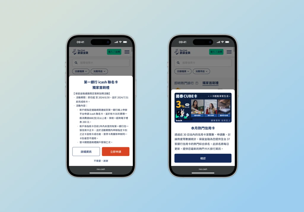
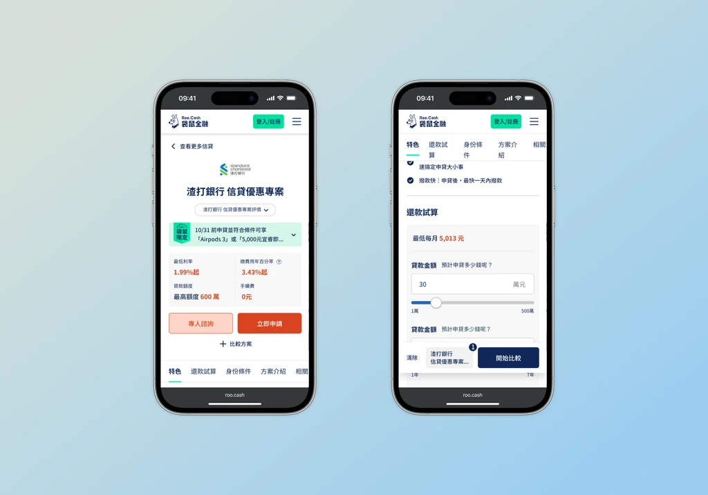
Roo.cash.

[01] Background
"Roo.Cash" is an anti-fraud financial product comparison platform launched by Gogolook. It offers the most transparent and accurate comparisons of financial products, along with professional consulting services. Roo.Cash is committed to providing users with fintech services that balance innovation and security.
[02] Branding
The visual identity is centered around the concept of the Kangaroo ("Roo") – symbolizing agility, protection, and trust. The "pouch" metaphor represents financial security and the accumulation of wealth. We utilize a clean and modern design language with warm, approachable colors to distinguish Roo.cash from cold, traditional financial institutions, making complex financial information accessible and friendly for everyone.
[03] Goals
Accelerate Financial Product Discovery through Design
To leverage design to streamline the user journey, allowing users to find the financial products they need more quickly and efficiently. The focus is on optimizing the user interface and experience to reduce search time and improve overall usability.
Enhance User Experience with Intuitive Navigation
To create a design that facilitates easy navigation and interaction with the platform. By implementing intuitive design elements, we aim to make it easier for users to access and compare financial product information, ultimately leading to quicker and more informed decisions.
Improve Information Clarity and Accessibility
To ensure that financial product information is presented in a clear and accessible manner. The design should prioritize readability and ease of access, helping users quickly understand product details and make decisions without unnecessary effort.
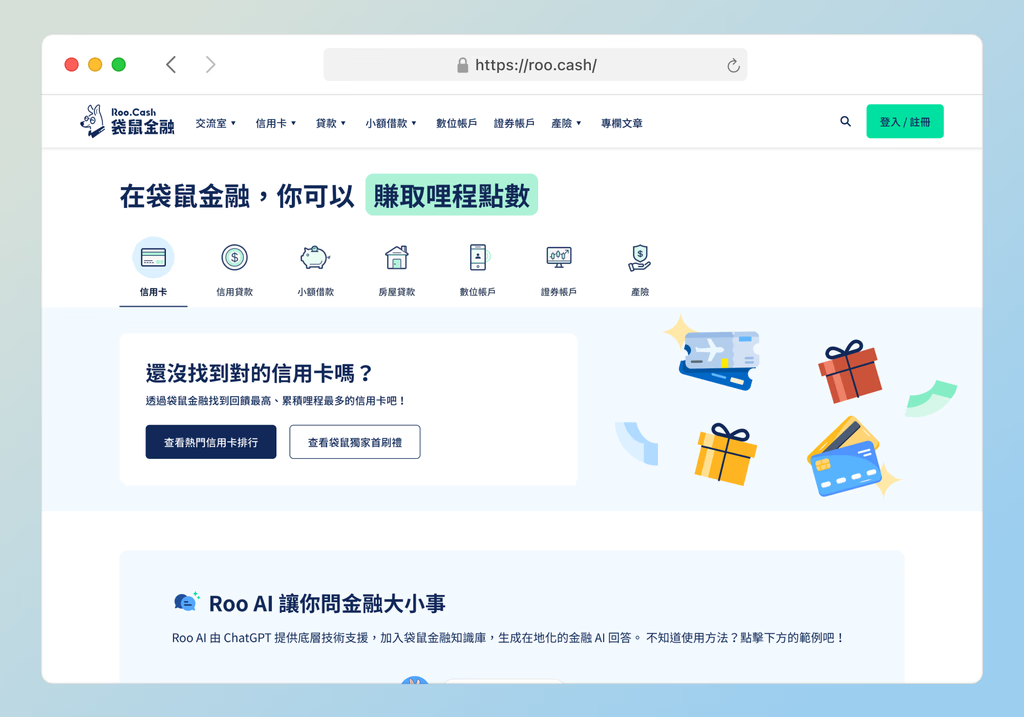
[04] Solutions
Streamlined User Interface Design
Developed a streamlined user interface that reduces complexity and highlights essential information. By simplifying the layout and focusing on key features, the design helps users quickly locate and evaluate financial products, minimizing the time spent searching.
Advanced Filtering and Search Features
Implemented advanced filtering and search features to enable users to refine their product searches with ease. The design includes user-friendly filters and search options that allow users to quickly narrow down their choices based on their specific needs and preferences.
Enhanced Visual Hierarchy and Information Layout
Created an enhanced visual hierarchy and information layout to improve readability and accessibility. The design emphasizes important product details and uses visual cues to guide users through the comparison process, ensuring that they can easily find and understand relevant information.